Off Broadway Shoe Warehouse
Checkout 2.0
After Off Broadway launched it's new website redesign on a new platform, they discovered a drop off in the checkout funnel. We approached this project mobile first and user-centered design.
What I did: Led the end-to-end redesign of OBSW’s checkout experience on a legacy SAP stack. This included user research, data analysis, UX flow restructuring, mobile-first UI design, prototyping, and usability testing. Worked cross-functionally with SAP engineers and QA to ship a high-conversion solution under tight platform constraints.
What I learned: Designing within SAP’s enterprise framework is more about strategic constraint navigation than pixel-perfect creativity. Success required system fluency, cross-functional trust, and a mobile-first mindset. The result was a leaner, faster, and more intuitive checkout that reduced abandonment and increased revenue.
Overview
OBSW is a high-velocity streetwear brand experiencing rapid growth — but their checkout flow on a legacy SAP system couldn’t keep pace. Customers were bouncing at critical steps, confused by the checkout sequence, and frustrated with limited payment flexibility. My role was to lead the complete reimagination of the checkout UX, working within SAP Commerce Cloud’s rigid constraints to deliver a streamlined, high-converting experience.
The Problem
We had two core challenges we needed to address:
- Business Side: SAP’s checkout logic was highly rigid — every field, state transition, and payment integration came with technical debt.
- User-side: Users were abandoning the process due to friction, confusion, and lack of mobile optimization.
- Symptoms of the problem:
- Checkout abandonment rate: 64.2%
- Mobile checkout completion lagged desktop by 28%
- Hotjar recordings showed hesitation, confusion with form field validations
- Users clicked away when encountering shipping/payment loading states
Discovery & Research
I performed a full audit of the existing checkout.
- Key UX issues identified:
- No progress indicator → Users had no idea how long the process would take
- Unlabeled error states → Inputs failed silently or with technical jargon
- Delayed loading states → Transitions between address/shipping/payment were slow
- Inflexible input formats (e.g., phone number, ZIP) causing failures
- Mobile layouts breaking at the address-entry step
-
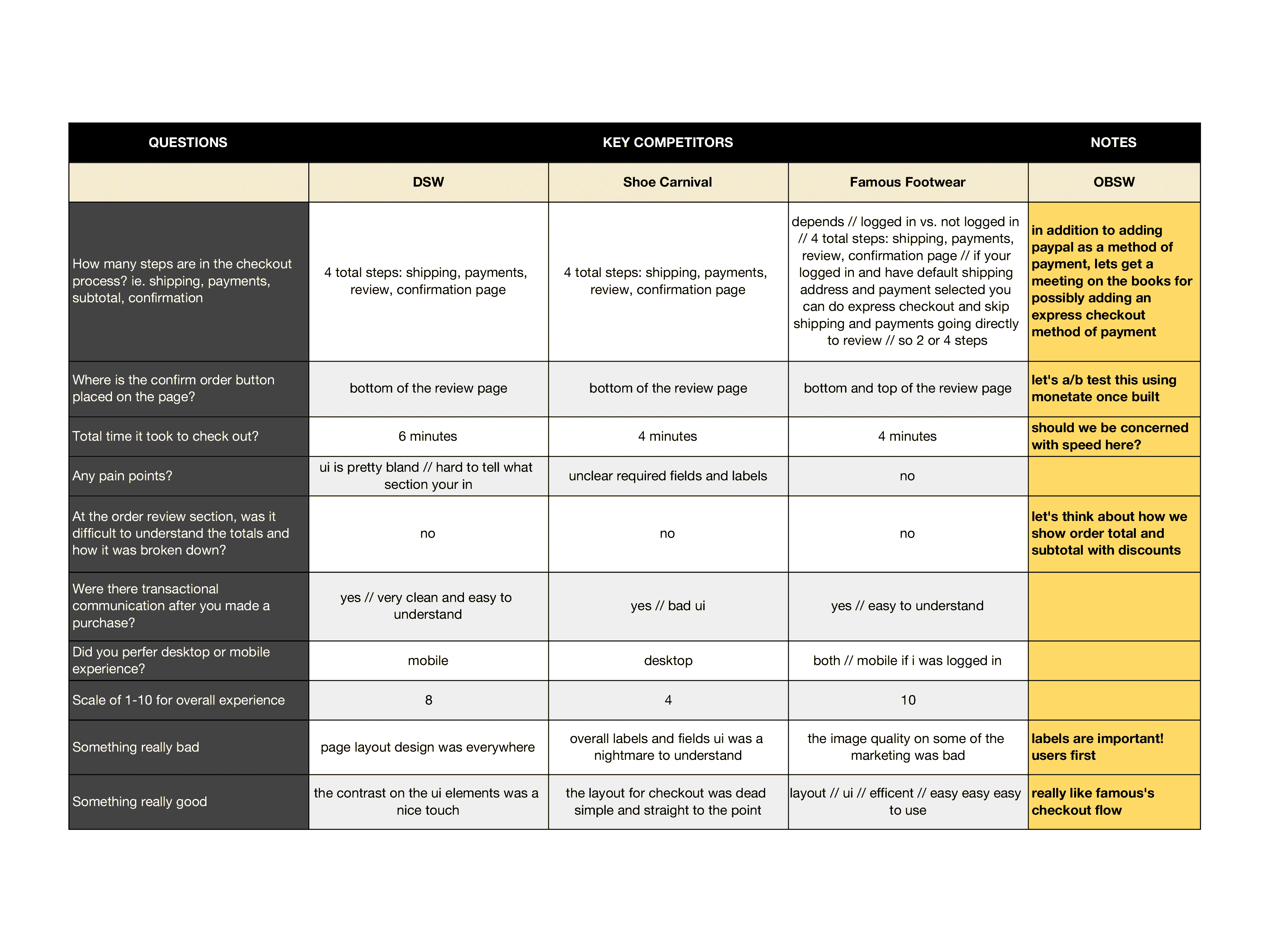
From here I did some competitive bench marking for:
- How they handle microcopy (e.g., shipping expectations)
- Use of autofill, one-tap payments
- Use of modal vs multi-step screens
Competitor Comparison Chart
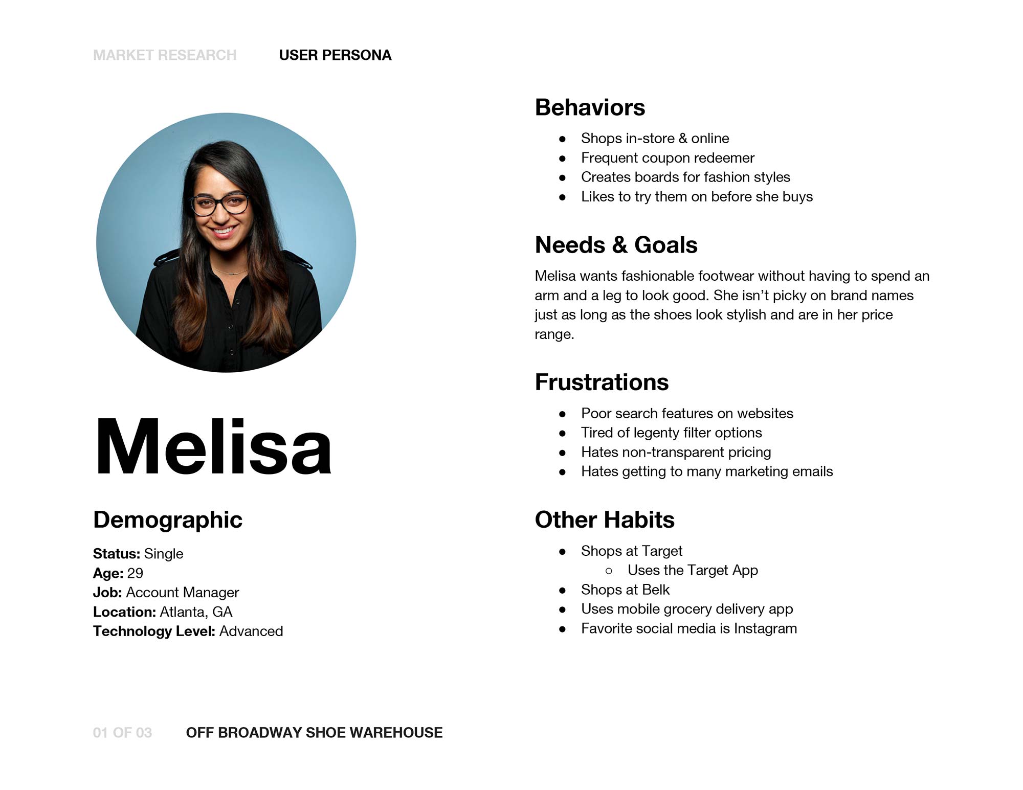
User Personas

Voice of Customer (VoC)
Understanding user sentiment was a critical part of framing the checkout redesign. While analytics told us what was happening (e.g., high abandonment between shipping and payment steps), we needed qualitative context to understand why. I synthesized two key sources:
Customer Support Logs
I worked closely with the support team to extract and analyze 12 recent tickets tagged with “checkout issue.” These were not simple bug reports — they surfaced deeper UX friction:
- Ambiguity around checkout completion: Several customers reached out asking whether their payment had gone through, citing a lack of feedback or visual confirmation.
- Redundant data entry complaints: Multiple users reported being forced to re-enter their address after switching payment method or shipping option — a byproduct of SAP’s rigid form state logic.
- Confusion about shipping updates: A few users added express shipping in the cart but saw a different rate or method displayed in checkout, eroding trust.
These pain points helped form hypotheses for what was breaking the user’s mental model of a “standard” checkout flow — especially among customers who expected fast, modern DTC experiences like DSW or Famous Footwear.
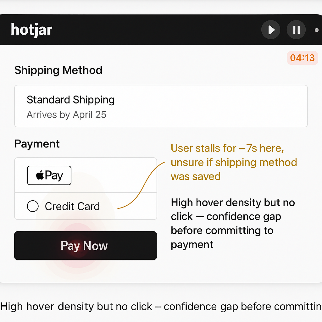
Unmoderated Usability Testing via Maze
To validate and deepen these insights, I ran 5 unmoderated usability tests on the existing flow using Maze. Participants were asked to complete a purchase scenario and narrate their experience using think-aloud protocol prompts.
Some sommon observations were:
“I thought I had already paid.”
This was consistently triggered by a combination of unclear page transitions, laggy SAP payment API responses, and weak feedback UI (e.g., loaders with no context or confirmation).
“Why do I have to enter my address again?”
This occurred when users selected an express payment option (e.g. Apple Pay), exited, and then attempted to switch to credit card — SAP flushed the prior address input, breaking continuity.
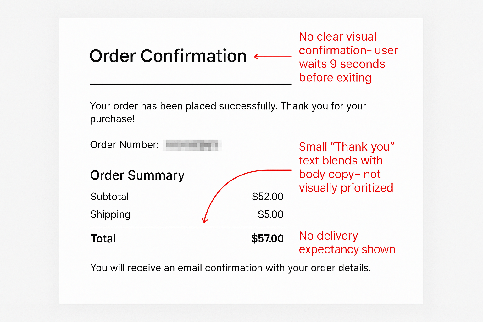
“I couldn’t tell if the order went through.”
Our confirmation screen lacked visual hierarchy — no large “Thank You,” minimal transactional cues, and no delivery expectation shown. Users lingered on the page unsure whether to close it or wait.
-
Behavioral Gaps Identified:
- Lack of real-time feedback during state changes (e.g., shipping → payment) caused hesitancy.
- Checkout steps did not feel sequential or progressive — users lost orientation.
- System behaviors (like re-validating address fields on payment type switch) violated UX expectations.
These qualitative signals became the north star for design priorities. They weren’t just bug symptoms — they revealed deeper mismatches between user expectations and SAP’s technical flows.
Design Strategy
Working within SAP meant designing for constraints — each field added or removed required backend logic changes. Our strategic shifts included:
- Move from a rigid 3-step wizard (address > shipping > payment) to a condensed smart form with progressive disclosure
- Introduce live shipping method previews post-address entry without needing a page refresh
- Optimize for auto-complete and keyboard-first input, especially on mobile
- Integrate Shop Pay / Apple Pay detection logic for fast-lane checkout
- Design non-blocking error validation, with instant feedback on zip/postal codes and card inputs
- Align every element to SAP's B2C extension framework and site accelerators
Prototyping & Testing
I produced low-fidelity wireframes first to collaborate with the SAP developer early (this helped flag logic we couldn’t easily alter). Then moved into a high-fidelity interactive prototype in Figma that simulated real-time validation and loading states.
- Key test sessions (via Maze and moderated):
- 8 users ran through the prototype end-to-end
- Tasks: Complete checkout, switch shipping method, detect error feedback
- Avg completion time decreased by ~23%
- 6/8 preferred the new checkout to our control group
-
Insights from this:
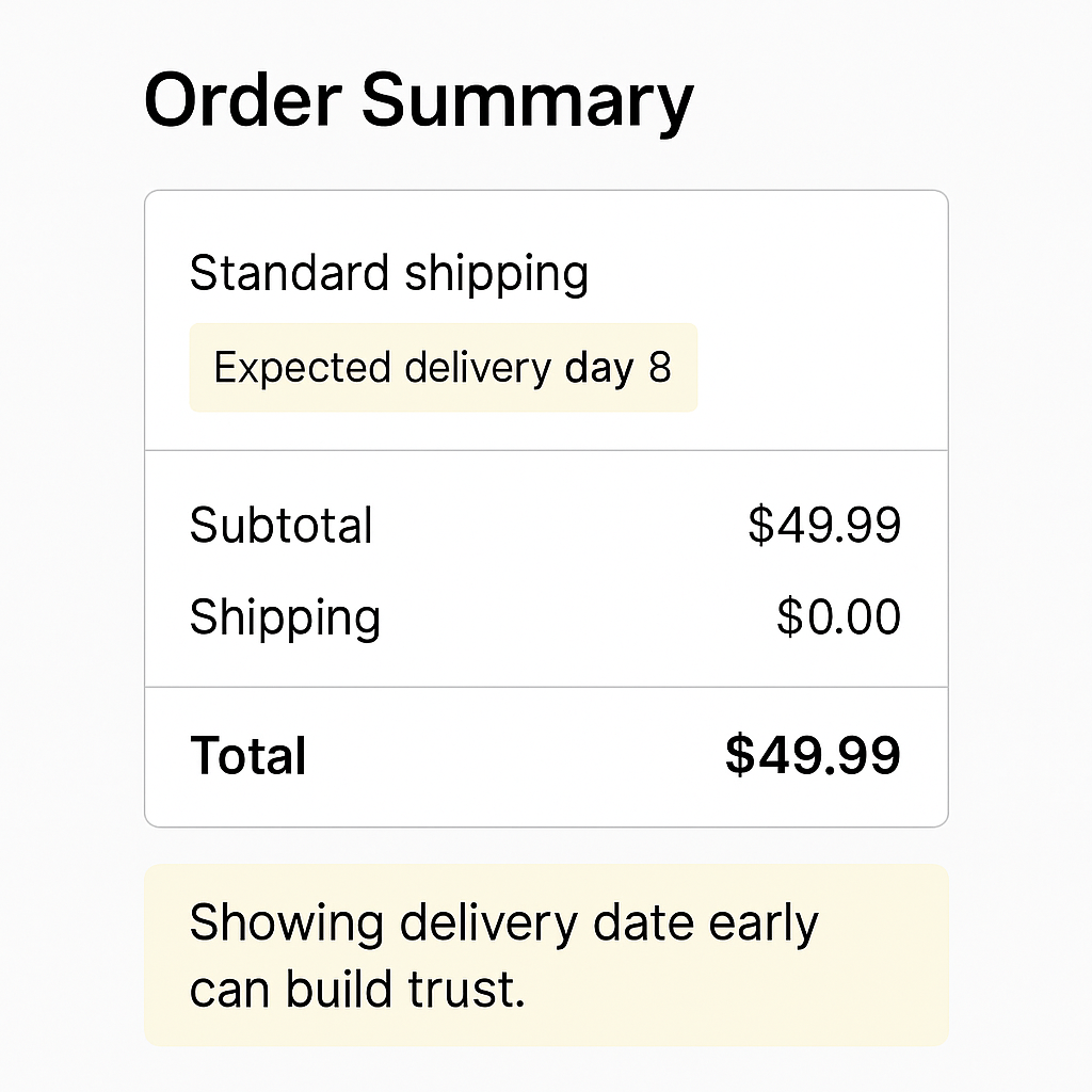
- Shipping clarity was a major trust-builder (“Show expected delivery date sooner.”)
- Users wanted Apple Pay shown earlier — we re-prioritized its detection
- Mobile keyboard behaviors (auto-capitalization, numeric keyboard) mattered disproportionately
Final Design
I redesigned the OBSW checkout into a 3 step, mobile-optimized flow that reduced friction and built user confidence. Key UX improvements included smart inline validation, a fixed live cart summary, and ZIP-triggered shipping options that appeared without forcing a new screen — all designed to reduce steps and maintain focus.
I collaborated closely with SAP developers to ensure feasibility, aligning my design components to SAP’s SmartEdit system structure. While I didn’t touch code, I provided detailed annotated specs, responsive layouts, and QA support across devices to ensure the design translated accurately in production.
View User Flows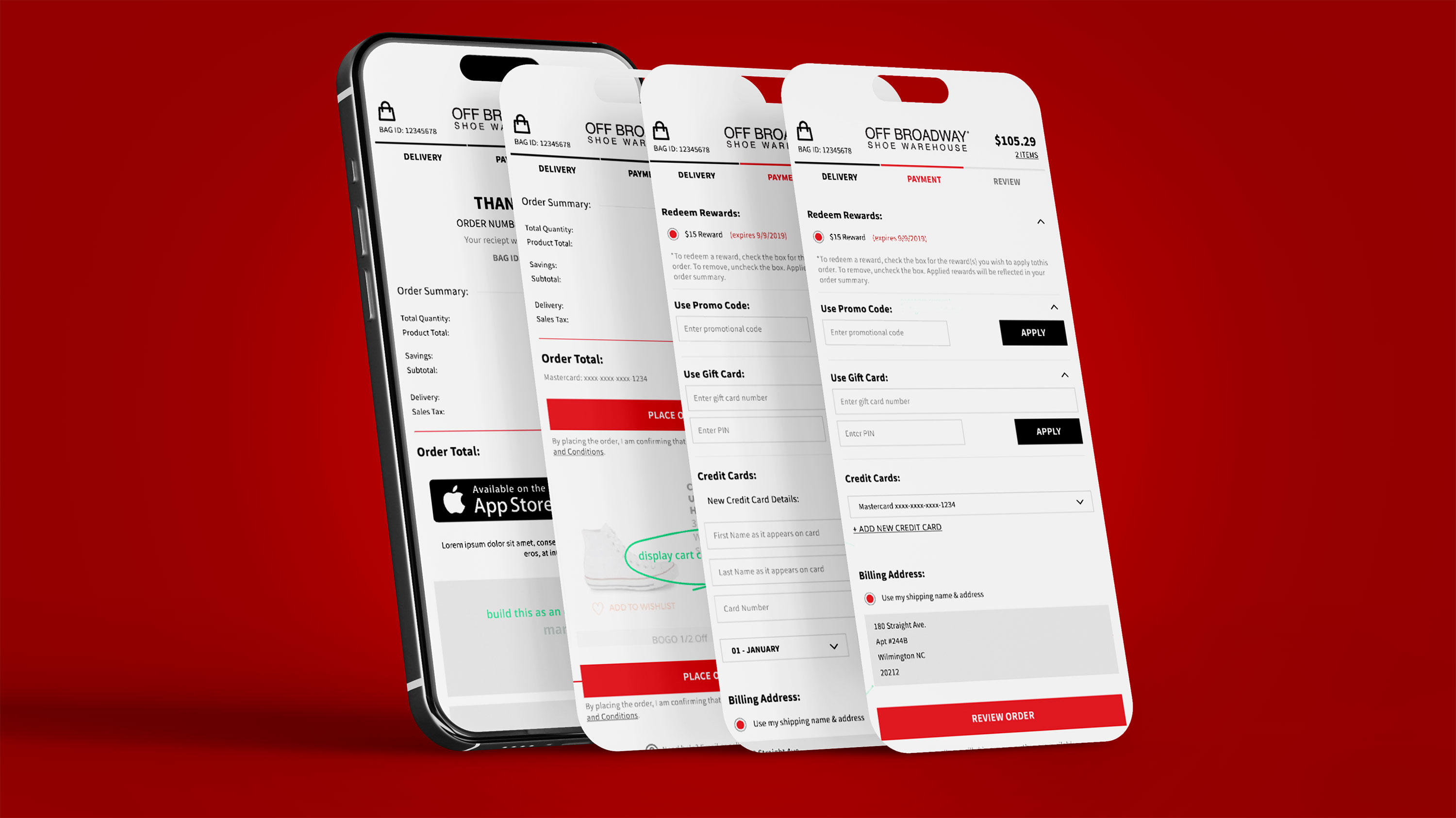
Outcomes
- Within 30 days of launching the new checkout:
- Checkout abandonment dropped to 48.6%
- Mobile conversion improved by 17.3%
- Customer support tickets about payment errors dropped by 42%
- First-time user NPS for checkout: +22 pts
Takeways
- Designing within SAP isn’t about pushing pixels — it’s about system design. I had to balance what users needed with what SAP’s architecture allowed.
- Every field is a trust decision. Even a missing ZIP format hint can break a sale.
- Mobile parity is non-negotiable. If it’s not optimized for touch, Gen Z bounces.
- Real collaboration with devs unlocks speed. Early flagging of blockers helped us move fast without costly rework.