Mood App
Camera Feature
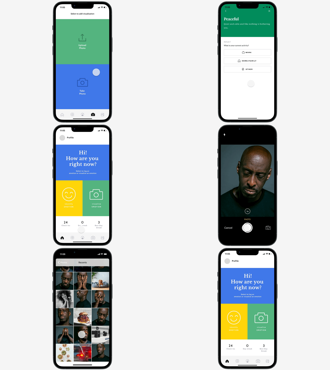
The Mood Meter is an app designed to increase users' awareness of their emotional states by combining in-depth emotional vocabulary with effective habit-forming features. Inspired by the work of Marc Brackett on emotional intelligence (EQ), the app aims to elevate society's EQ levels. The addition of a camera feature was a simple yet impactful enhancement. It seamlessly integrates into the app, allowing users to document their mood by pairing a photo with their daily mood selection.
View Final Prototype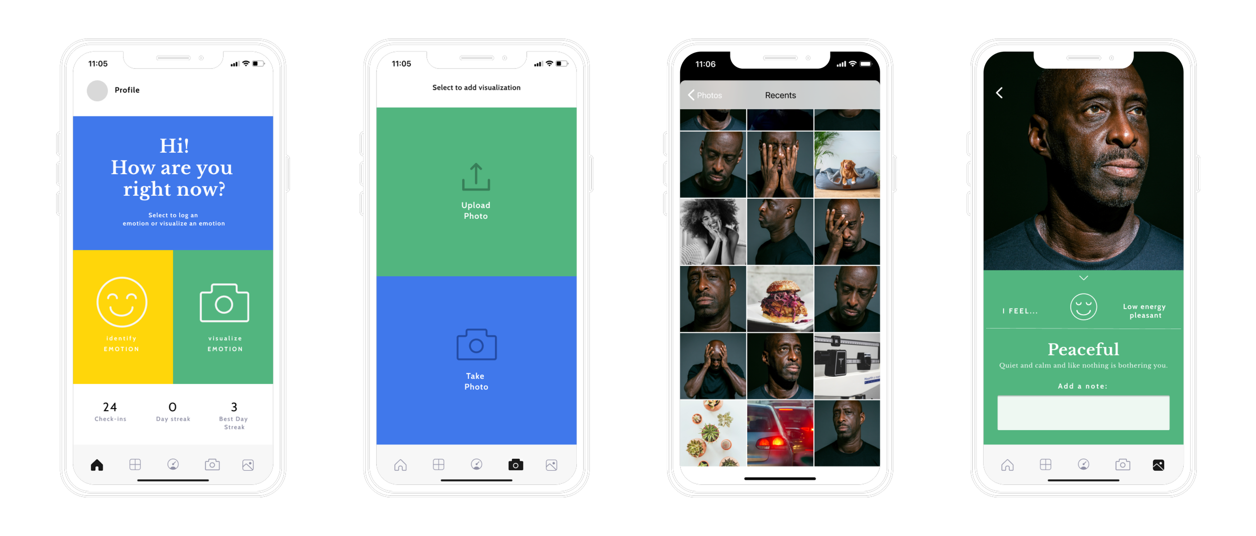
What I did: Conducted user research, competitive analysis, and usability testing to design and implement a camera feature in the Mood Meter app, enhancing users' ability to track and understand their emotional states visually.
What I learned: Integrating visual elements like selfies can significantly aid in emotional self-awareness, but it's crucial to address user concerns about authenticity and privacy to ensure effective adoption.
Relevance
Emotional intelligence, often overlooked, is vital for successful human interactions. Marc Brackett's work has provided a framework and glossary, translating into a curriculum for young children to understand their emotions better. However, high EQ is beneficial for all, not just children. The Mood Meter app extends this knowledge and awareness of EQ tracking to everyone.
Understanding our emotions is crucial for improving our mental health, especially in today's challenging times.
Problem
One of the significant challenges in accurately understanding our emotional state is our reliance on a limited glossary of emotions and feelings to communicate and comprehend how we feel.
While such tools can be helpful, a crucial element is missing: the visual component, which would allow us to perceive our emotional state on a deeper level.
Project Goal
Enhancing awareness and emotional intelligence (EQ) is essential for maintaining mental health and overall well-being. One effective way to achieve this is by visually observing our emotions on our faces and documenting them through the app. By recognizing our facial expressions and linking them to our emotional states, we can gain a deeper understanding of our thoughts, feelings, and behaviors.
Moreover, by logging this information using a mobile app, we can track our progress over time and identify patterns that may contribute to certain emotional states. This process can help us regulate our emotions more effectively, leading to a greater sense of self-awareness and EQ.
Solution
The solution is to add and implement a low-effort, high-impact camera and photo album feature to the existing app.
Plan
Adopt a modified version of design thinking. Given the project's specific requirements, a streamlined plan is necessary. The steps used in other case studies are not applicable here.
Empathize
Why is it crucial to comprehend our emotional state? How do other apps aid us in achieving this understanding?
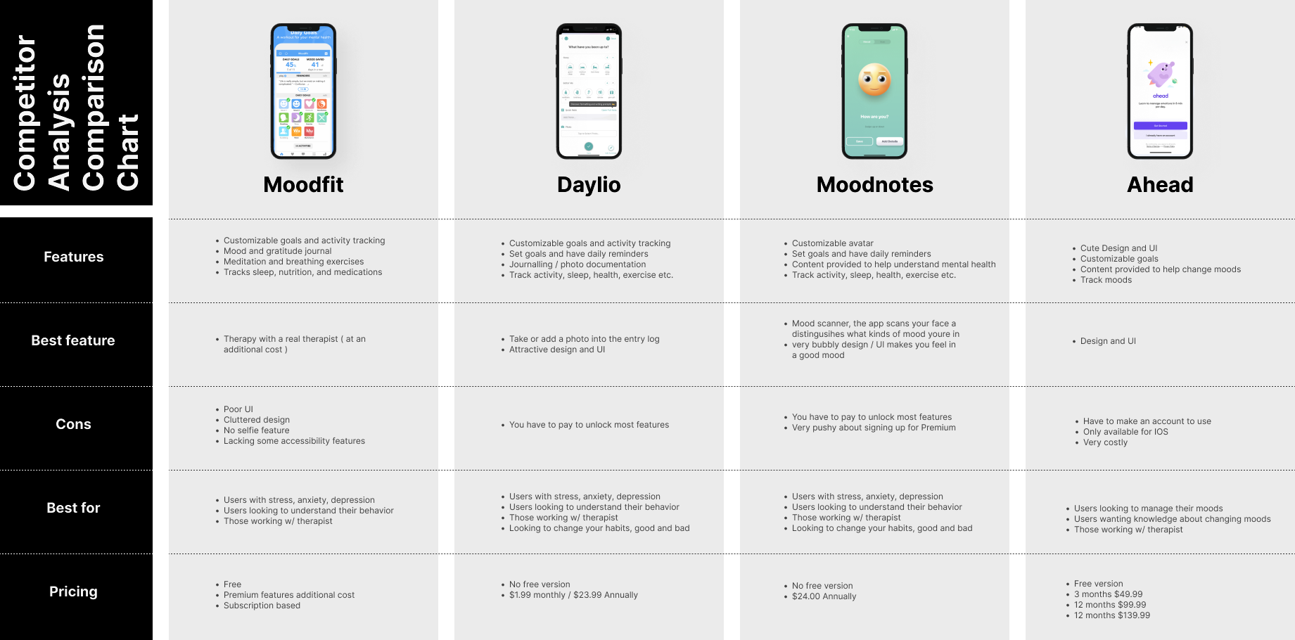
Competitive Analysis Findings
The top four competitor apps shared similar features with the Mood Meter app. However, none of them offered the ability to take photos and store a visual component. This discovery highlighted a gap in the market, confirming my initial hypothesis.
Research Plans & Interview Questions
I developed a research plan along with interview questions to focus on the following areas:
⭐️ Gain a deeper understanding of how users identify their emotional state.
⭐️ Learn about the apps users are currently using to track or note their EQ / mental health.
⭐️ Investigate the motivations behind users' interest in learning about EQ and their mental health.
Selecting the right interview candidates is crucial for the success of the project. While I acknowledge that many UX researchers often use a questionnaire to find suitable subjects, I chose not to utilize this step for this project. However, I made sure to include a diverse group of participants.
My rationale was as follows: Emotional intelligence and mental health awareness are topics that impact every individual. While some delve deeper into these topics than others, I believed that gathering multiple perspectives during my research would help me develop a more inclusive and accessible app for all users.
Imporant Interview Takeaways
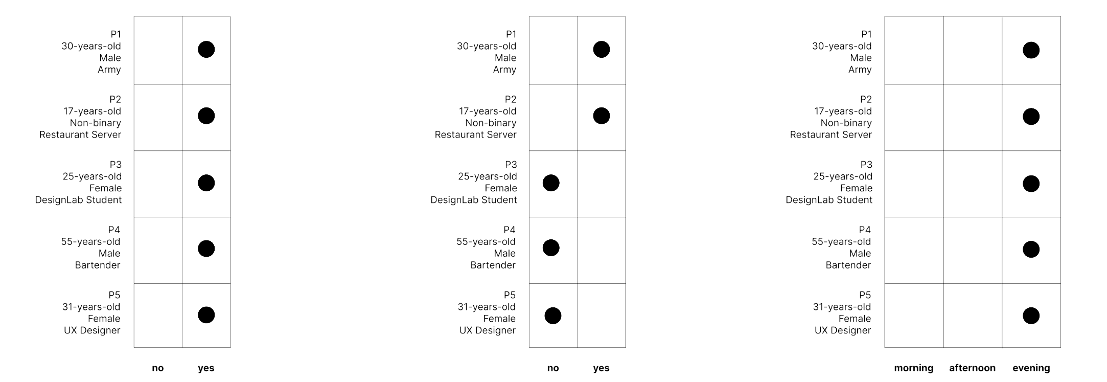
- Q: Would a visual aid, such as the camera feature, be desired and/or helpful in identifying your emotional state?
A: 100% of participants agreed that the visual aid would be helpful, regardless of whether they were already tracking their emotional or mental health state.
- Q: Would it be helpful to upload a photo corresponding to your emotional state entry?
A: A common concern expressed was about authenticity. Participants stated that uploaded photos might not accurately reflect their true feelings, allowing more room for misrepresentation and not being as honest as taking an on-the-spot selfie.
- Q: At what time of day are you most likely to use an emotional tracking app?
A: While this question may seem straightforward, it's significant to note that our design should include a camera with a flash. This ensures that we cover all lighting situations that users may encounter.
Empathy Map & Persona Building
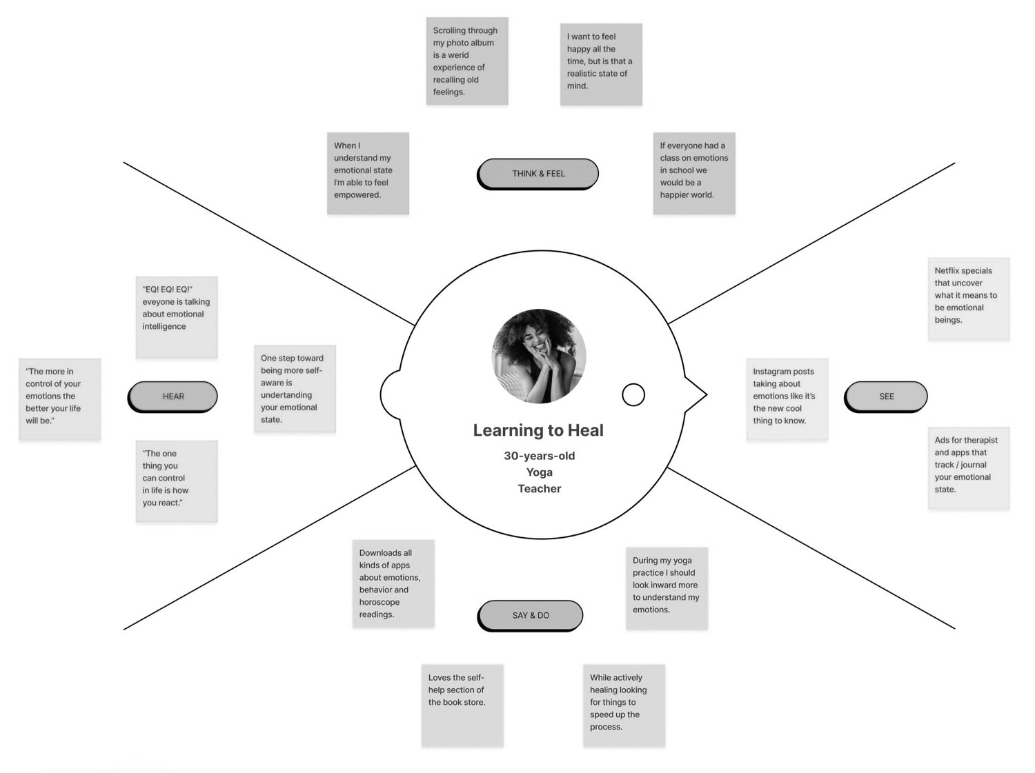
Synthesizing the information from all my research presented a significant challenge. By organizing the data into my empathy map, I found a harmonious balance that would represent the ideal user. It was crucial to emphasize that the user was intentionally focusing on enhancing their emotional intelligence, rather than it being a mere coincidence. Naming my persona "Learning to Heal" provided valuable guidance during the persona-building phase.
Research Key Findings
Based on my competitor analysis and user interviews, the following consensus emerged:
- Research Summary
▪️ Users have a growing interest in understanding their own emotional state, as evidenced by the abundance of EQ/mental health apps in the market. User interviews provided further support for this trend.
▪️ While the market is saturated with apps on this topic, many lack a crucial visual component, such as a camera feature.
▪️ User interviews highlighted that linking a visual component to the understanding of our emotional state is significantly more helpful than not having that feature.
- Design Details
▪️ Users envision a camera icon located both in the lower navigation and within the post flow.
▪️ A flash feature needs to be added to the camera to ensure photos can be taken in all lighting conditions. User interviews indicated that users would likely use the app at night.
▪️ This feature represents a low-effort, high-impact upgrade for the Mood Meter app.
- Solution Check
I have validated my hypothesis to ensure that I'm on the right track to developing a viable solution for this project. Two important facts emerged:
✅ Based on my competitor analysis, there is a gap in the market that the enhanced Mood Meter app can fill.
✅ Users confirmed that the proposed added feature would benefit their efforts to understand their emotional and mental states.
User Flow
I emphasize the importance of minimizing the number of decisions users need to make to achieve the desired outcome. Placing the camera button in the lower navigation simplifies the decision-making process for users. They can now quickly take a selfie and log their post without unnecessary steps.

Lofi Sketches
Pencil and paper wireframes are quick and effective. Stepping away from the computer allows your hand to connect with your brain, facilitating rapid idea generation and problem-solving. I created these lo-fi wireframes in 30 minutes or less, providing the framework for my high-fidelity wireframes.

Hifi Sketches
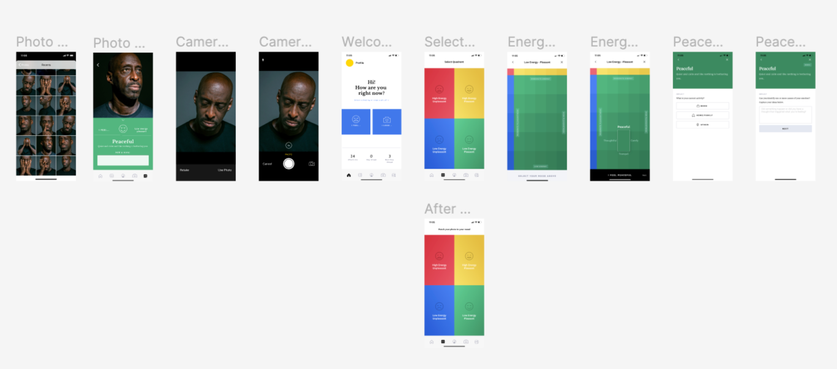
Creating the hi-fi wireframes posed a challenge. As I recreated the lo-fi wireframes, I realized I had overlooked some important elements regarding the lower navigation. See below for a detailed breakdown.
The Details
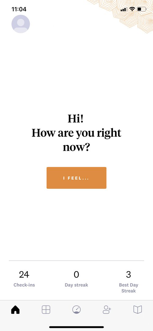
Before starting the wireframing process, I envisioned only minor changes to the home screen navigation. However, after usability testing, the entire home screen underwent significant modification.
Iteration One
Iteration Two
Iteration Three
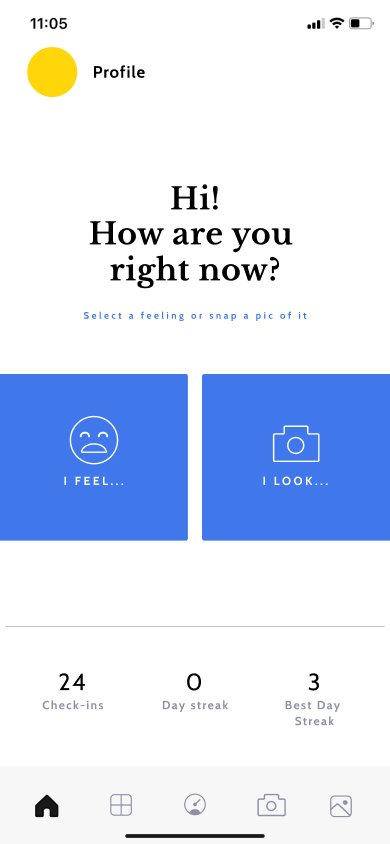
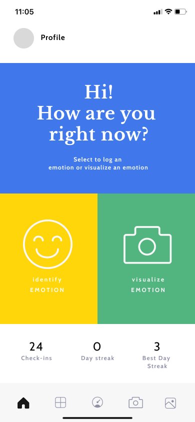
Continuing with the color-blocking theme, I used color blocks as buttons. However, this approach was revised after receiving feedback. Participants found these buttons appeared to be floating, so I anchored the section by adding a color block behind the welcome message.
Additionally, I incorporated iconography from previous screens, adding the camera icon to the main home screen. This clearly indicates the two entry points outlined in my task and user flow.
A Small Issue
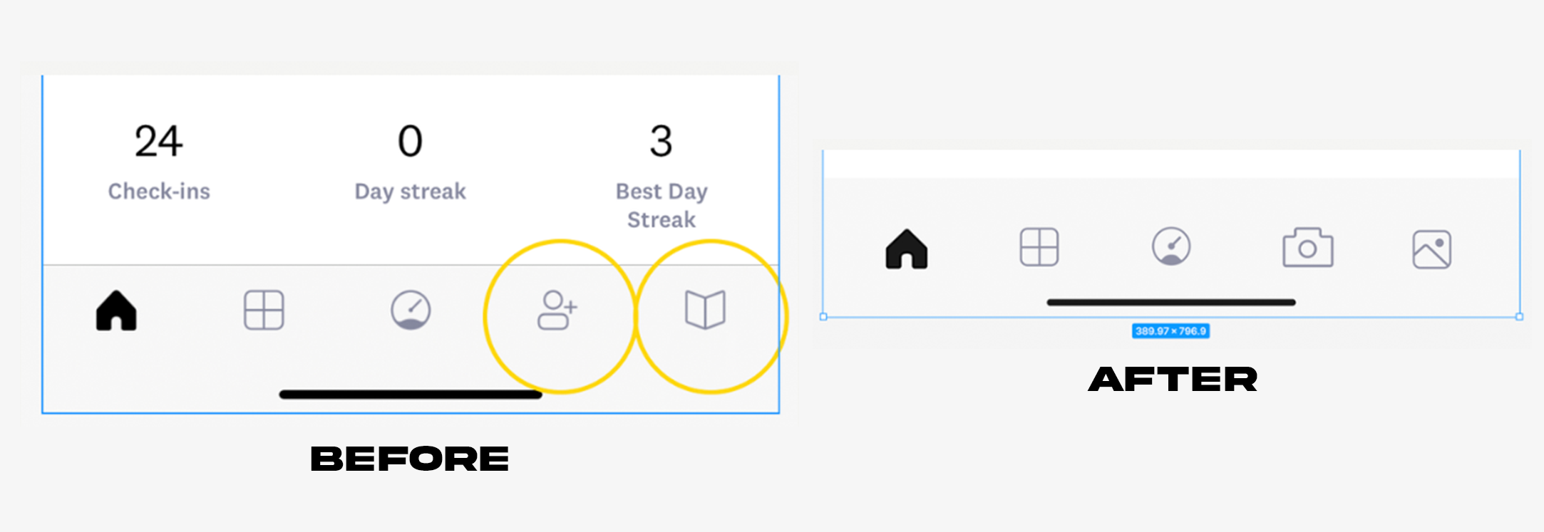
It's important to note that these decisions were crucial for the app's usability. As I designed the navigation, I realized that adding two new button icons to this space would disrupt the proper spacing needed for a user's fingertip.
Based on insights from user interviews, I knew the camera icon placement, and eventually the album icon, needed to be in the lower navigation bar. After consulting a group critique, I decided to remove the "library" and "sharing" icons. These buttons didn't contribute significantly to the overall flow..
User Testing
The prototype is now ready for testing, marking the final phase of the project: user testing. I have prepared my usability testing plan document and specified that I will conduct 1:1 FaceTime interviews to collect user testing data. Additionally, I have created a document containing usability testing interview questions.
The questions include both qualitative and quantitative aspects to gather a diverse dataset for creating my priority revisions.
- Goals for testing were:
✅ Enable users to visually identify their emotional state through the camera feature
✅ Enhance the way users track their EQ/mental health
✅ Facilitate users' understanding by pairing a "selfie" with selecting an emotion
User Testing Results
Conducting 1:1 user interviews allows me to gather information beyond participants' verbal responses. By observing their interactions during the guided test, I can identify areas where they struggle or experience moments of satisfaction. Below are the synthesized results:
- Wins:
✅ The additional camera, photo album, and note tracking features are helpful and desired.
✅ Clear and intuitive look and design.
✅ Easy-to-use navigation.
✅ Seamless app navigation.
- Opportunities:
🟠 Welcome page wording needs to be revised.
🟠 Blue buttons should be more clearly identifiable as buttons.
🟠 "I feel" icon should be more neutral.
🟠 Add an "upload photo" flow.
🟠 Add color to navigation to indicate the selected page.
🟠 Enlarge some text for better readability.
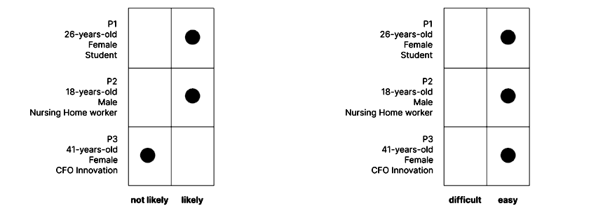
- Q: Now that the welcome/home screen includes the option to take a photo of your emotional state, how likely are you to utilize this button? Explain your thoughts. (Less than 50% of the time or More than 50% of the time)
- Q: Please rate the level of ease or difficulty of taking a selfie using the new camera feature. (1 - very easy to 10 - very difficult)
Affinity Map
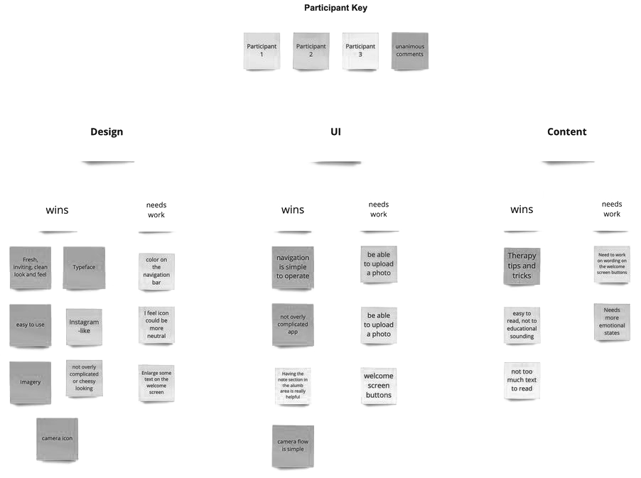
I completed my affinity map by grouping both comments and answers from the 1:1 user interviews into three categories: design, UI/interactions, and content. Categorizing them this way laid the framework for my priority revisions. By using a unanimous color in my key, I identified the most important revisions based on unanimous comments for each section.
Final Update
During the 1:1 interviews, a significant design change emerged. Users expressed a desire to upload a photo corresponding to their emotion, contrary to my earlier research findings, which suggested users feared this feature might be misused. Incorporating this feature required adjustments to the flow, the addition of a new screen, and changes to the home screen verbiage to be more open-ended.
