A Better Search
I wanted to redefine how the search / explore page is used...What if you could bring more user control and freedom to explore content on Instagram? Could that better inform the algorithm, producing relevant, more personalized content leading to useful and better engagement? This case study is simply an experiment for a redesign of the Instagram search and explore page. Nothing more, nothing less. It brings a refreshing approach to the exploration and discovery of people and communities on the worlds fastest growing social media platform. And my personal fave.
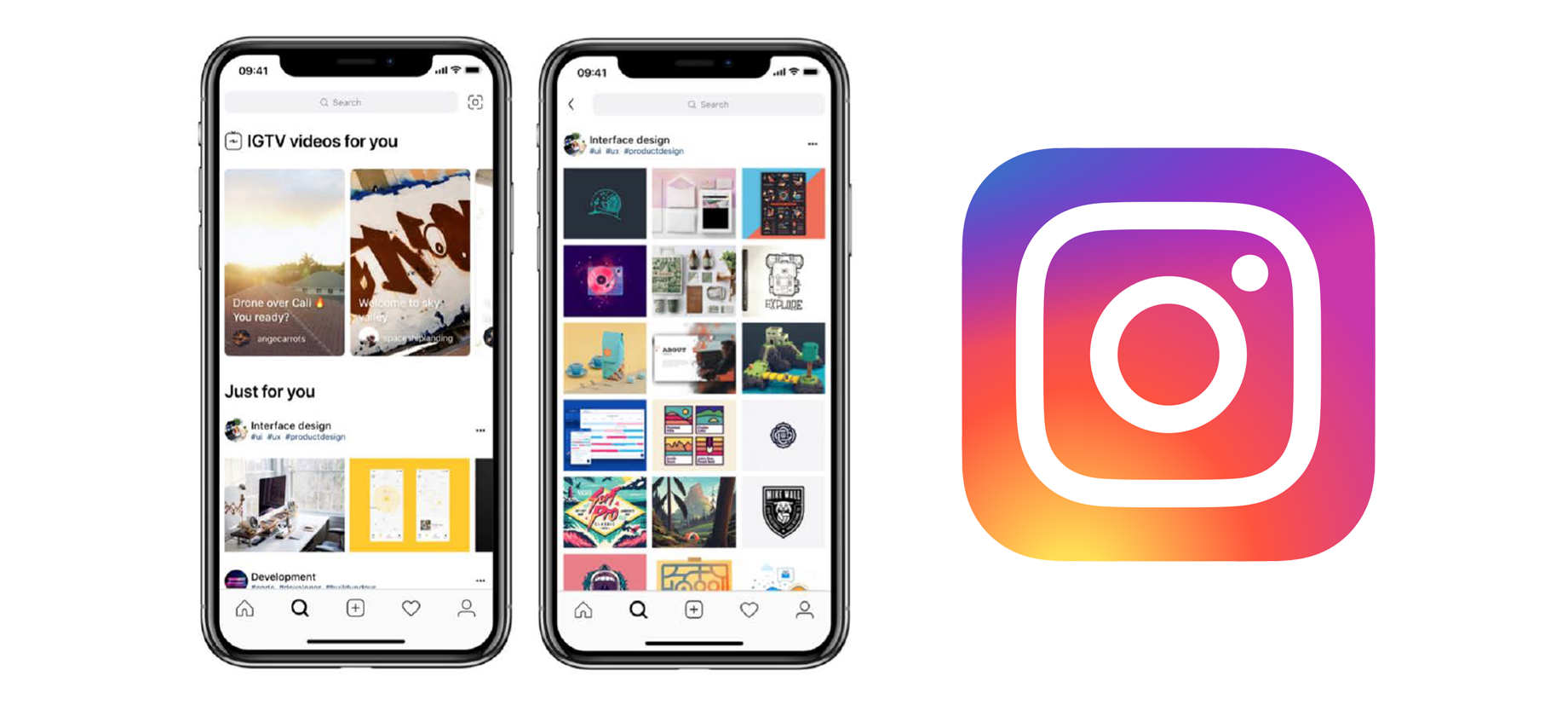
The Problem
I personally find the current view of Instagram's search page to be incredibly destructive by the nature of its function. Instagram has wonderful communities of content creators, yet the experience does not enable users to make their own decisions when searching for content or provide context to what we're viewing.
I'm sure there's a better rationale behind the decision for the information architecture on the search and explore page—and I'm not trying to solve a problem that may or may not exist. This is just a view from a different perspective. I set off to see if others felt the same and if so, create an alternate version.
Posts are selected automatically based on things like the people you follow or the posts you like.
Problem Statement
I conducted research based on a process through multiple methods and built a "problem statement" from my discoveries.
"If the experience belongs to the user, how can I design an experience that gives the user control to discover, engage and contribute?"
The Solution
Introduce a little autonomy. You'd be surprised by how people can learn quickly and understand the usage of an app like Instagram when they're in charge and have control.
That being said, having no boundaries is not necessarily a good thing. Instead, try building an environment where the user has the freedom to explore but isn't immersed within a black hole, boundless by infinity.
Guiding Principles
I defined three guiding principles that helped me transform the experience.
- 🗣 Communicate to the users
- 👔 Be transparent & upfront
- 🚦 Make it efficient but simple
Starting the Approach
When designing the experience of a product, my focus is on understanding the users' pains and transforming those pains into pain relievers. To do this, I need to discover what the secrets are at the core of their problem. What's their current circumstance or situation? Why do they even use/want to use this service?
User Research
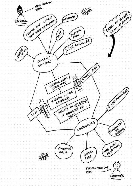
I interviewed a few of my peers to get a better understanding of how they used Instagram. From the results, I distilled their behaviors into personas that represent two different types of users.
Knowing the different user types helped me put the different experiences into perspective and informed my decision on the structure and the hierarchy of content.
🤳 Content Creators
A content creator is more than someone who shares images captured in moments. They work a lot on the content they post to Instagram with the purpose of creating value for the consumer.
💅🏻 Content Consumers
Consumers are identified from those who are actively using Instagram but rarely post content to their feed or stories (at least relative to the amount of time spent consuming content).
Conducting Surverys
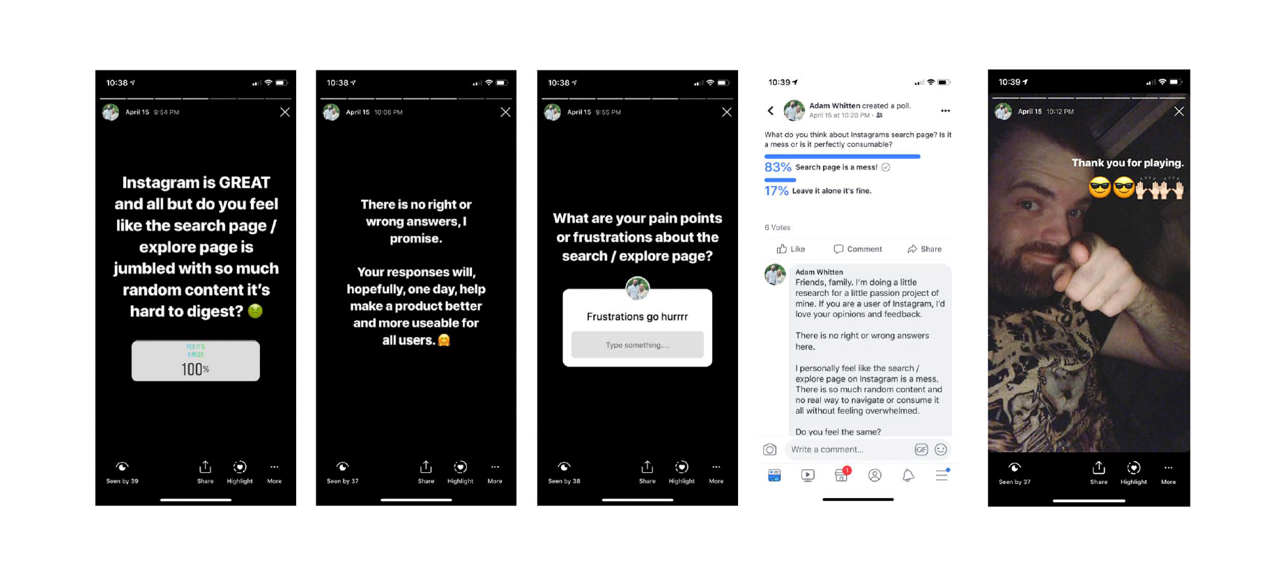
To test my hypothesis, I took to Instagram & facebook to conduct my research. It's only fitting to use the platforms for testing right?
The Results
👆 89% of people found the content they discover relatively random
👇 11 % of people felt Instagram's search should be left alone.
The quantitive research proved the assumption that giving the user more control on what the content they discover could possibly lead to a better experience.
The hypothesis tested; assumptions validated.
Starting Designs
My approach for the redesign was to make the experience better without radically defying the existing, familiar design of Instagram.
After careful consideration, analysis and tests among some of my peers, I selected the most viable option of the formed sketches. The selected mocks reflected the core principles and scored the most satisfactory after the initial tests.
Below, I'm defining what's in common and what's different between the creators and the consumers...
Sketches Cont.
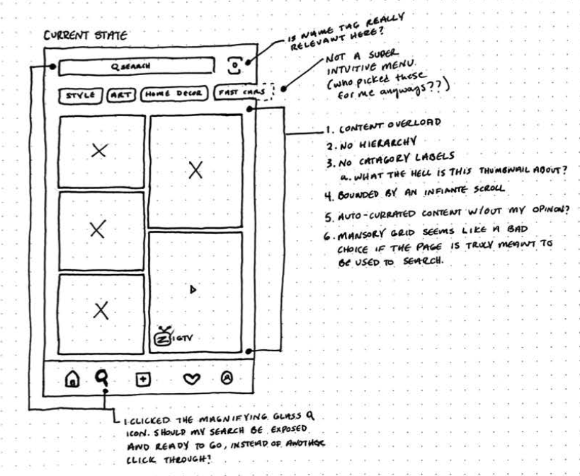
Sketches of the current state of the search / explore page and listing some of the big issues.
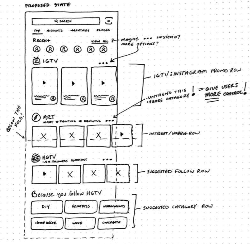
New and improved page after a couple of failed attempts at designing something that worked for everyone.
- Key Components
▪️ Promoting IGTV (it's currently hidden)
▪️ Interest Row
▪️ Suggested Follow Row
▪️ Suggested Categories
▪️ Because You Follow Row
All rows will have a 3 dot menu just like in the current UI. The user will be able to "un-trend" that row or category if he/she sees fit.
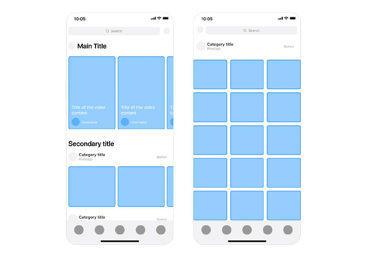
WIREFRAMES
I kept these really simple and high level. I didn't want to overthink the design too much. I wanted to keep it looking like Instagram, we're just adding some new sections. A next step of higher fidelity for users to give feedback.
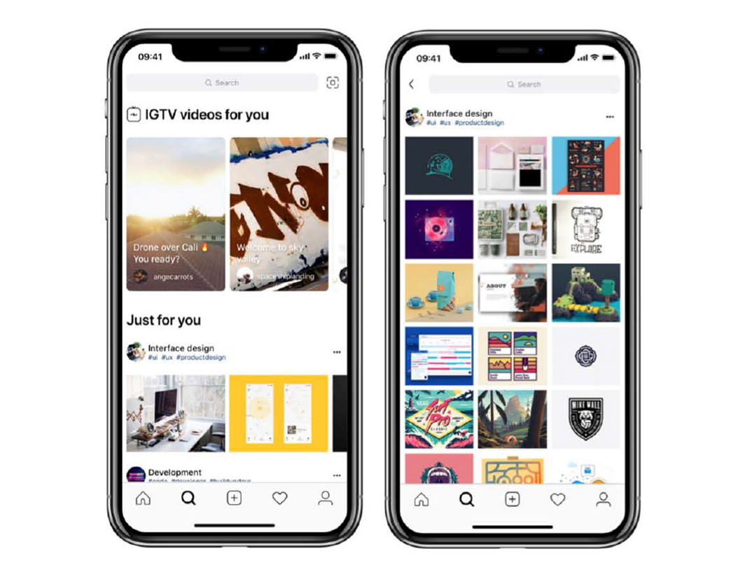
FINAL DESIGN
Here is the HIFI comps provided to the user for final design and user testing.
What I Learned
There wasn't a prototype that functioned with real data, the posts displayed in the mocks weren't what the user typically consumes, therefore the content probably wasn't practical in terms of relevancy.
But I did gain some insights from verbal feedback, such as how simplified the UX feels, how the UI looks approachable, well organized and how they can see the page better serving their experience when exploring.
Secondly, I don't have access to the type of data and insights the design team at Instagram use. Therefore a lot of the insights in this exercise were based on assumptions or from a minority of users.
There are a million different ways I could have sliced and diced this project. For example I may have taken another approach if I was solely focused on searching for friends in the search area (some of which are represented in my initial sketches).
To solve a problem, you first have to isolate the problem and its pain points. Although Instagram is by far my favorite platform to use, it's littered with usability flaws in my opinion.
