Bookies.com
Betting Picks
The Bookies EDGE Sales Page redesign project took place in June 2022. Bookies.com, which was launched in 2018, was acquired by the GDC Group (formerly Kax Media Ltd). I have been working full-time at the company and was the first Lead UI/UX Designer for Bookies, primarily the sole designer on the project.
What I did: Led the redesign of a high-conversion sales page to restore UX integrity after stakeholder-driven changes diluted the original experience.
What I learned: Navigating the tension between user clarity and internal business needs is a design leadership skill that goes beyond pixels.
Objective
Although there was an existing Sales Page, it had been altered numerous times due to stakeholder requests made directly to Product Owners and Developers. These changes resulted in the original design and essence being significantly altered.
Consequently, the Sales Page failed to provide the necessary information for users to make an informed decision about purchasing our Subscription Plan, and it did not adhere to UX best practices.
The product in question is BookiesEDGE. Subscribers to EDGE can access expert betting picks for various sports. They can opt for Annual or Monthly Subscriptions and receive betting picks recommended by the "Handicappers" via email, SMS, or directly in their member area on the site.
In the American market (our primary target), these sports experts are referred to as Handicappers (or cappers), while in Europe, they are known as "Tipsters."
Business Requirements
- ⭐️ Explain what BookiesEDGE is
- ⭐️ Detail the Subscription costs
- ⭐️ Highlight the benefits of our product
- While this was a good starting point, it did not address all the gaps present on the current page.
User Research
Recognizing that the current page did not adequately address users' primary questions and seemed unconvincing, I initiated user interviews and testing. However, the company did not permit direct outreach to our actual site visitors for several reasons and was unwilling to fund such research. At the time, we had a subscription with UserTesting.com, so I used that platform to find participants matching our target audience through screener questions. This enabled me to conduct user testing and gather valuable insights.
I tested both the desktop and mobile versions of the BookiesEDGE page.
Desktop Version
Mobile Version
Demographics
Based on Google Analytics, our target demographics are:
- ⭐️ Men
- ⭐️ Ages 25-45
- ⭐️ Residing in the United States, specifically in NJ, PA, WV, IN, and NV. At the time, sports betting was legal in only a few states, so we targeted those where it had been legal the longest to find individuals who might have paid for expert picks before.
Screener Questions
Due to the limitations of our UserTesting.com plan, which allowed only two screener questions, I crafted questions designed to identify the best matches without revealing the test's true purpose.
🔘 = Users Didn't Align With
🟢 = Users That DID Align
Question One
Which of the following apps/sites are you interested in the most? (Select one)
🔘 Bookstores – Reject
🔘 Pet Walking – Reject
🟢 Sports Betting – Accept
🔘 Financial Planning – Reject
Question Two
Which actions listed below best describe your behavior?
🔘 I use my mobile phone to place bets on sports a couple of times a year just for fun – Reject
🟢 I place bets often and sometimes buy picks from professional handicappers to help me bet on the NFL, NBA, or other major leagues – Accept
🔘 I place bets often but don’t buy picks from professional handicappers. I do my research and make my betting decisions on my own or with friends – Reject
🔘 I only place bets at brick-and-mortar sportsbooks and do my research/make betting decisions on my own or with friends – Reject
🔘 None of the above – Reject
These screener questions helped us find participants who not only have an interest in sports betting but have also purchased picks from professional handicappers.
User Testing Questions
You are a sports fan who usually buys picks from professional handicappers/sports experts to make more informed betting decisions. You are researching picks and want to find the best option before committing to a pack or subscription.
Participants first saw a blank page to provide unbiased initial insights. They then answered the following questions:
- What key information do you look for in a Paid Picks pack or subscription? Explain why and how this information would convince you to make a purchase. Be as detailed as possible.
- Visit BookiesEDGE page. Describe your feelings as you navigate this page. Please do not leave this page during the test.
- What is this page for?
- Would you feel confident signing up for this service? Explain why.
- If you could magically redesign this page, how would it look and what information would it contain? Be very detailed.
- Do you have anything to add?
I conducted tests with 5 participants for the mobile version and 5 for the desktop version. The first question provided valuable insights into users' informational needs, with additional useful input gathered from subsequent questions.
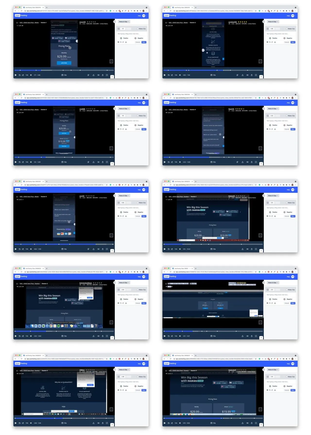
Screen Shots from User Testing
User Insights
During the test, users expressed that they wanted the following information when considering paid picks:
- Cost of Picks: How much do the picks cost?
- Sports Covered: Which sports do the handicappers cover?
- Handicapper Profiles: Who are the handicappers, and why are they considered professionals?
- Analysis Process: What kind of analysis do they perform to determine good picks?
- Handicappers' Records: What are the handicappers’ records (e.g., win percentage, wins vs. losses)?
- Return on Investment: How much money can they win versus the betting stake and the cost of the subscription?
- Delivery Method: How are the picks shared? Are they delivered via email, text message, or directly on the site?
- Picks History: What is their picks history? They wanted diagrams or indications of previous picks to identify patterns of wins and losses.
- Handicapper Specialties: Which leagues or teams are the handicappers best at making picks for?
- Performance Display: They wanted to see handicappers displayed in a contest format to compare performance.
- User Testimonials: Testimonials from other users about the handicappers or the product.
- Transparency: Emphasis on honesty and transparency in picks history and records.
Overall Feedback
The feedback gathered from users after reviewing the page included:
- Pricing Clarity: Some users were confused about the monthly or yearly charges due to unclear pricing.
- Perceived Value: Most users thought the price was reasonable but could have been confused about the actual meaning of the prices.
- Subscription Preferences: Some users preferred buying a picks bundle per season or per sport instead of a monthly or annual subscription.
- Lack of Key Information: Nearly all users noted a lack of core information about the handicappers, such as their records and picks history.
- Confidence in Subscribing: A few users did not feel confident subscribing to EDGE due to insufficient information about the handicappers.
- Trustworthiness: Most users found the site trustworthy but would only subscribe after learning more about the handicappers and their records, highlighting the need for detailed handicapper information.
- Pricing Placement: Most users appreciated seeing the pricing plans at the beginning of the page.
- Design and Aesthetics: Most users thought the page looked attractive and typical of what they are used to, finding the design and color scheme enticing.
- Site Exploration: Most users wanted to browse the rest of the site to learn more about Bookies but refrained due to the test's focus on the Sales page.
- Page Purpose: All users quickly understood the page's purpose—“Here I can pay for a subscription to get handicappers' picks.” However, the page lacked details on how and why users should subscribe.
Screen Shots from User Testing
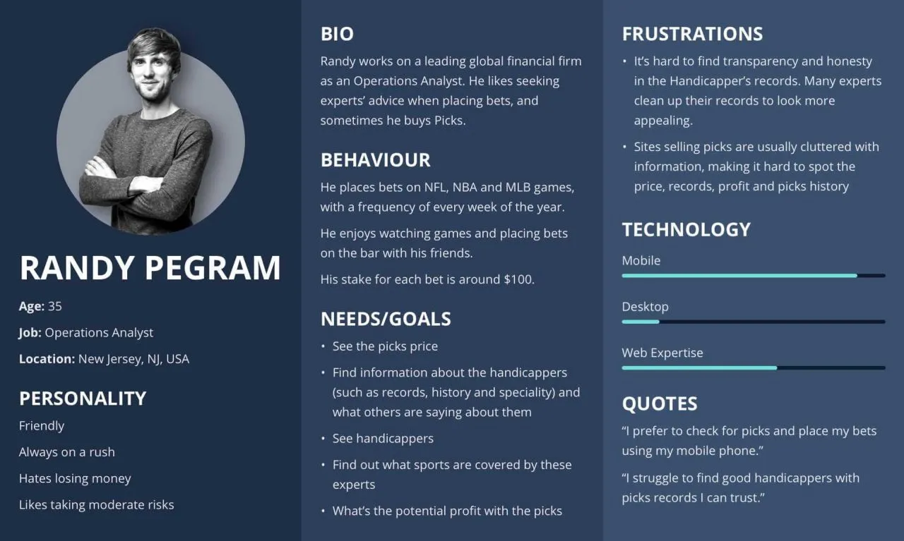
Persona Development
Analyzing the people who would actually pay for picks helped us build a persona representing the typical consumer of this specific service.
Competitor Analysis
To understand how other sites sell or provide picks, I analyzed the following competitors. By taking screenshots of each, I identified insights and patterns to better address the picks subscription model.
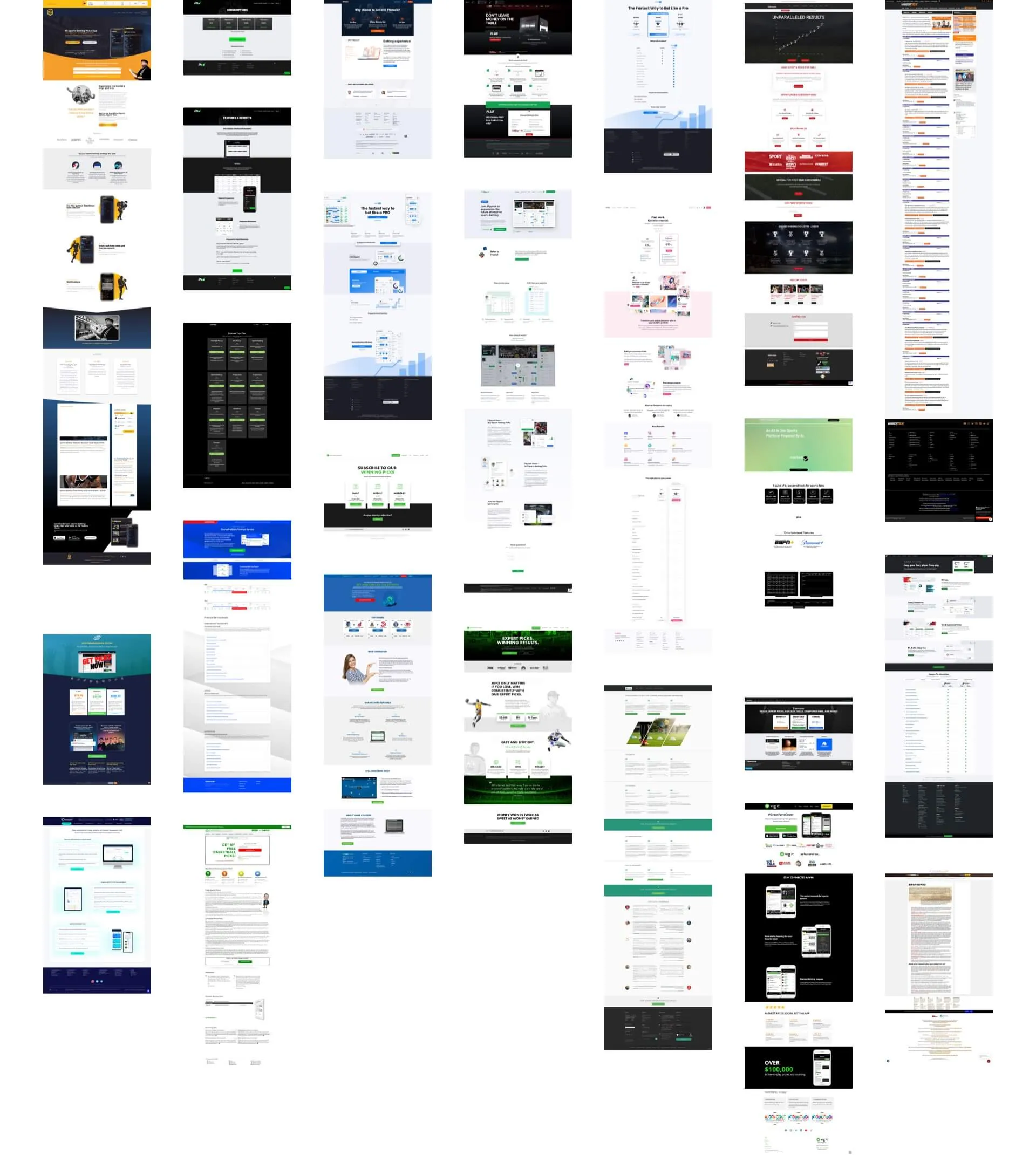
This analysis provided valuable insights into how to effectively present and sell picks subscriptions.
The Plan
Our goal is to address user needs identified in the test and incorporate value propositions observed on competitor sites.
- Simplify the Pricing Plans
- Clarify sports coverage
- Display handicappers, including their faces and records (with links to their pages)
- Add testimonials
- Show profit information — win versus betting stake and subscription cost
- Explain the subscription and pick delivery process
- Highlight the benefits of subscribing to BookiesEDGE
- Emphasize transparency in pick records
Potential Blockers
- Picks History Display: After discussions with Developers and the Product Owner, we realized displaying picks history directly on the page would affect page speed. Instead, we can provide a link to the picks history.
- Handicapper Contest Display: We cannot display handicappers in a competitive format as suggested by a user because it goes against the business decision of not pitting them against each other within the same subscription plan.
- Gathering Testimonials: We need real user testimonials. While we are unsure if we can obtain them, we are including placeholders in the design and will attempt to gather the actual data.
- Pricing Plan Bundles: The business decision is against offering pricing plans as bundles per season or per sport.
- Profit Information Display: Initially, I wanted an interactive display of "how much money they can win versus the betting stake and the cost of the subscription," but due to the development time required, this will be represented as an image for now.
- New Handicappers: The inclusion of new handicappers in EDGE could pose a challenge, especially since some are freelancers and may not want their images displayed.
Wireframes
User testing and competitor analysis provided valuable insights for creating wireframes. I sketched rough ideas and iterated them until satisfied with the information layout. Below is a detailed example of my wireframes and notes.
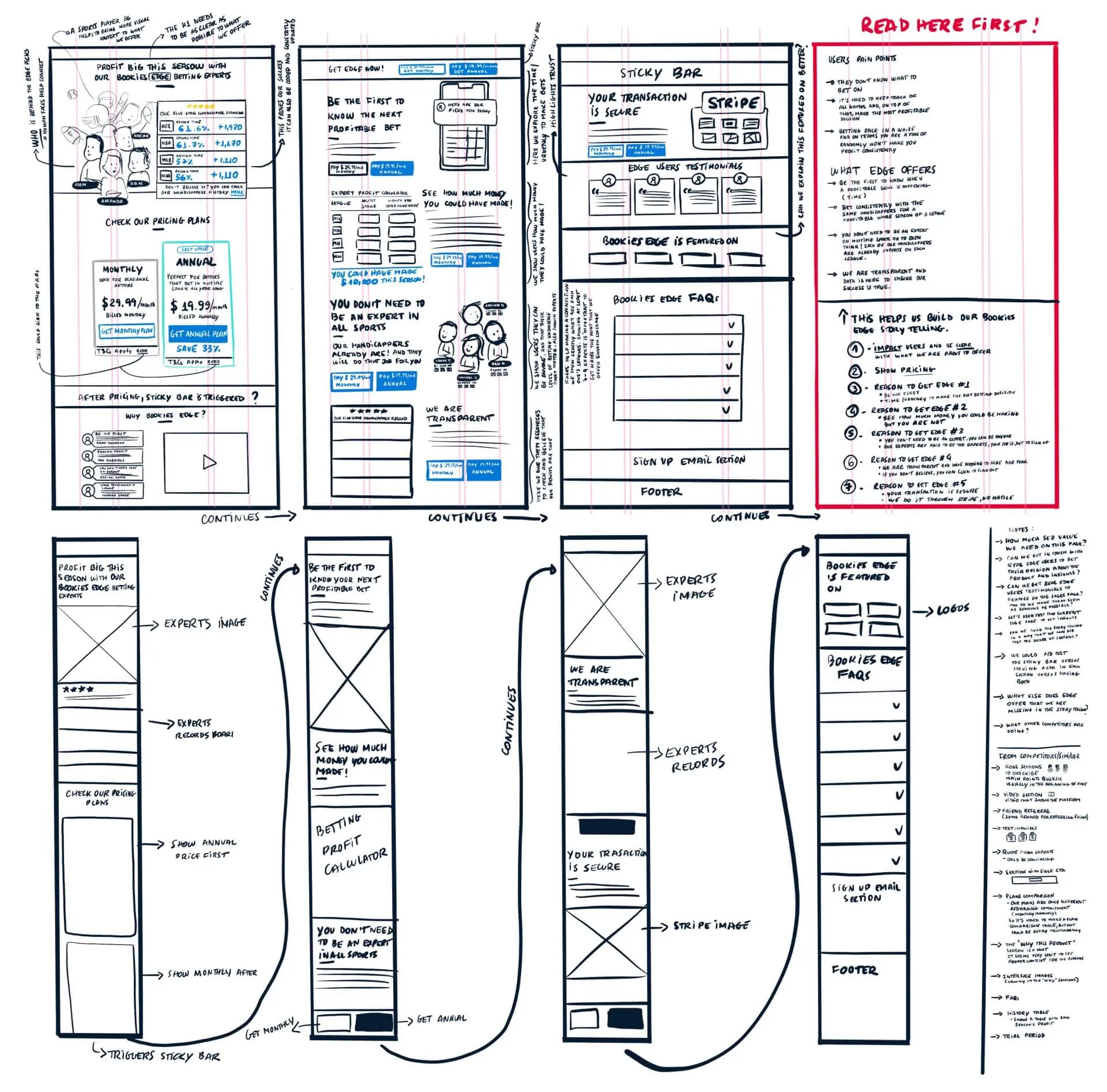
I shared this rough wireframe with stakeholders for feedback. After incorporating their adjustments, I moved on to create a mid-fidelity version using Sketch software.
High Fidelity Designs
The wireframes were approved, allowing us to proceed with the high fidelity designs. However, a new blocker emerged—while we confirmed four handicappers for the page, two of them were freelancers, and we could not use their images in the hero section.
This version isn't fully representative of what will go live, as future decisions may impact which handicappers are featured. For now, I included only the images of the confirmed handicappers, Adam Thompson and Dan Kilbridge.
I also created all the content myself for testing purposes. While this is not the final content for the live site, it serves as a guide for content editors to produce copy that aligns with the ideas shown in each section.
The page doesn't need to be real yet, but it needs to look real—like a façade. This approach allows me to run another test using UserTesting.com to gather insights at this design stage and identify any major usability issues.